How safe is my county if SHTF?
Today, I’ll break it all down for you—clear, actionable, and to the point.
But before we dive into the data, let’s get on the same page about what makes a county risky in a SHTF scenario.
What Makes a County Dangerous in a SHTF Scenario?
Dangers vary depending on where you live, and they fall into two broad categories:
-
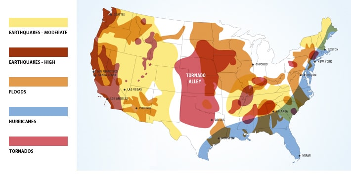
USA Natural Disaster Risk Per Region Natural Disasters
Depending on your location, you may face:- Hurricanes (Atlantic & Gulf Coasts)
- Tornadoes (Midwest & South)
- Wildfires, Earthquakes, Droughts (West Coast)
- Tsunamis (Pacific Coast)
- Blizzards, Avalanches, and more
- Man-Made Disasters
This includes:- Riots, civil unrest, or war
- Financial collapse
- Mass starvation
- Nuclear fallout
- EMP strikes
But here’s the kicker: Risk multiplies dramatically with one single factor—Population Density.

Want a free 78 item preppers checklist?
Enter your email below to instantly download this Complete Checklist PDF. No purchase necessary. 👇 👇Why Population Density Is the Ultimate Risk Multiplier
No matter the emergency—natural or man-made—high-density urban areas are hotbeds of chaos when resources run out.
Think about it:
- Food or water supplies get cut off.
- People panic.
- Within 3 to 5 days, lawlessness erupts.
The results? Mass lootings, riots, theft, and worse. Civilization holds together when there’s “enough.” If not? Total collapse.
The takeaway: The further you are from the chaos, the safer you’ll be.
So to help better understand this risk… I created this searchable spreadsheet that includes EVERY US County:
Note: You can quickly find a specific county using your devices ‘search functionality’…
- On PC Desktop Use: Control + F
- On Apple Computers Use: Command + F
- On Mobile Devices: Go to browser your settings and look for something like: “Find in page”
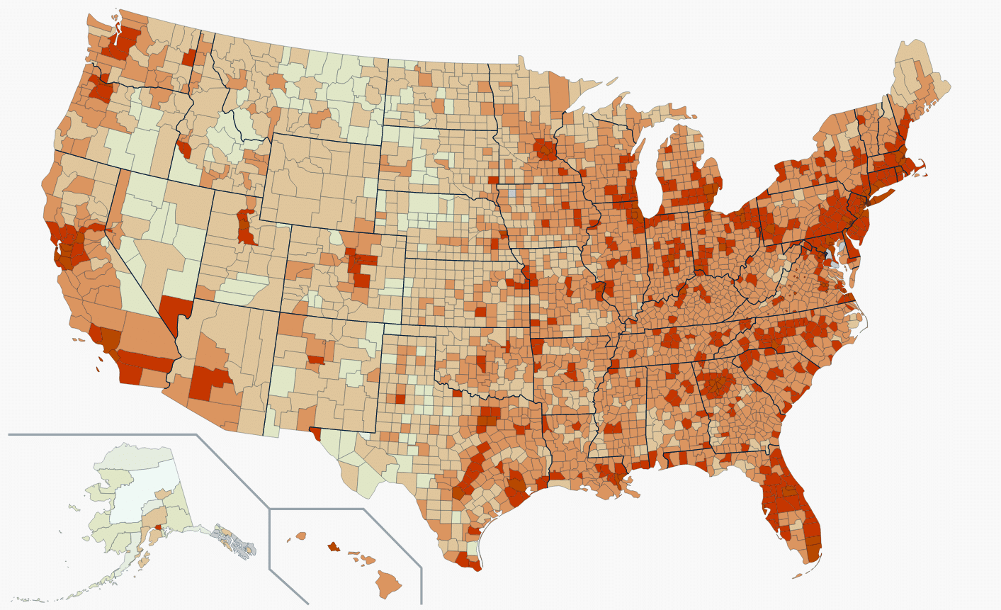
Or here’s the map you can click on to zoom and find you county:

Want a free 104 item bug out bag checklist?
Enter your email below to instantly download this Complete Checklist PDF. No purchase necessary. 👇 👇Breaking It Down: Risk Levels by County
I crunched the data, county by county, to identify danger zones. Here’s how I categorized the 3,142 U.S. counties:
- Hell on Earth
These are the most dangerous counties. In a collapse, these areas would be consumed by lawlessness. If you live here, your options are limited:- Stockpile massive supplies (and defend them).
- Plan an immediate bug-out route.
- It’s Still Gonna Get Nasty
Slightly better but still precarious. Supplies and planning are essential to survive the initial chaos. - Not Safe Yet—Must Be Ready
Suburbs and metro-adjacent areas. Neighbors might band together, but you’re still close enough to urban spillover to face challenges. - On Edge—Remain Diligent
Smaller cities and rural areas with some breathing room. You’ll need solid preparations but are far less likely to be overrun. - Decent—Can Relax a Bit
These counties offer relative safety. Far from dense populations, they’re well-suited for resilience and bartering communities. - Phew…Safe Haven
These are your best options. Lower-density areas, far from urban centers, where you can build self-sufficient systems like farming or aquaponics.
The Data Behind the Rankings
To create this list, I combined two datasets:
- County-Level Data
I analyzed population density by county to pinpoint high-risk zones. - State-Level Data
Statewide population density offers additional context. For example, a low-density county in a high-density state might still face spillover risks during a crisis.
Using a weighted formula (95% county data, 5% state data), I ranked every county in the U.S.
What You Should Do Next
- Find Your County
Use the searchable spreadsheet to locate your county’s risk level.
- Assess Your Plan
Based on your risk, decide whether to:- Hunker down and fortify.
- Relocate to a safer area.
- Prepare Now
- Stockpile food, water, and supplies.
- Build community bonds for mutual support.
- Join The Resilient Life, a program I designed for people like you.
TRL the BEST way I know to get more prepared FAST.
It’s consists of:
- An engaged community of like-minded folks
- Badges you can earn (think Scouts for Preppers)
- Lots of =challenges you can take
- Biweekly video calls with ME and other members
Click here now to see a better overview of this product, such as:
- Why you need it
- What it provides
- A sneak peek tour
- Tons of member reviews/testimonials
- And current pricing
I think you’ll be blown away at how unique this offer is and the reasonable price point.
So don’t wait; click here now to check out The Resilient Life.
[DETAILS] How The Data Was Found, Analyzed & Why It Matters…
First, I pulled the “State” level information.
State Data
At first, I thought this might be helpful.
I figured it would show me where the worst “Danger Zones” are.
And so, I quickly found each States estimated population (based on US Census Data):
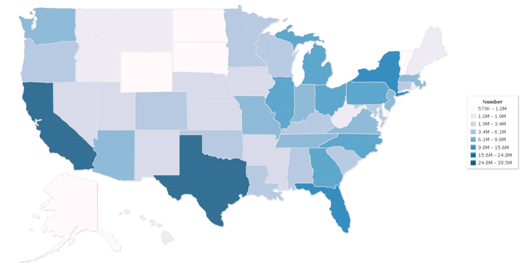
And while looking at Raw Population data by State is interesting…it was nearly worthless to tell me what I really wanted to know.
I mean, with State Population data, you’re NOT comparing Apples to Apples.
Comparing Texas to Rhode Island’s is less than helpful at the Statewide level.
Those two States’ Land Masses are not even in the same category.
So how do we “equalize” these vastly differing States to get a number that’s useful?
You take the Raw Population and divide THAT number by the Land Mass (square acres).
Now you have:
How many people there are PER square mile in each State.
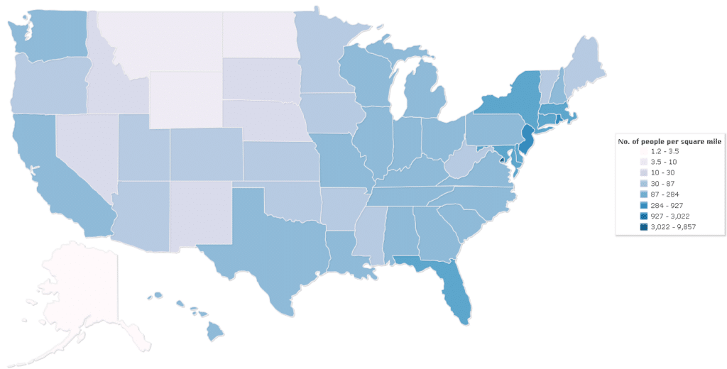
This was better.
This information was somewhat helpful.
Now I could compare vastly different-sized States and see which had more people packed into them.
For example:
We all know New Jersey is a small State and is very cramped, right? And the data rings true.
New Jersey has ~1,158 people per square mile.
Great, but how does THAT compare to…Florida (another State with LOTS of people)?
Florida has ~414 people per square mile.
That means Jersey is roughly 3X more dense than Florida.
So, if you live in Florida, you’re much safer from SHTF risk than Jersey…
But not so fast…
Florida is a reasonably large State, right?
But are the people living there evenly spread across the entire State? No way!
We all know most folks squeeze in along the coastlines.
And the lowest part of the middle of the State is all Swampland and National Parks.
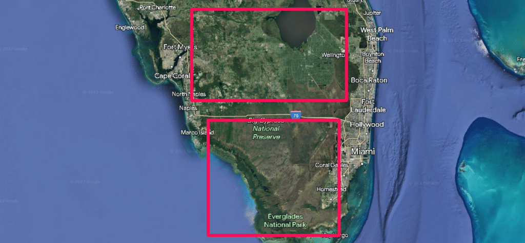
Since New Jersey is a relatively small State, its average density seems reasonable.
Sure, some areas will be higher than the 1,259 and others lower, but the differences between the highs and lows will be fairly close.
But this is NOT the same in Florida.
The difference between the cities and the rural swamp locations are miles apart.
It’s like comparing the Sun to the Moon.
So now we’re back to “square 1,” and the only way to help achieve data that can be helpful is to chop these States up into smaller areas.
And this is where counties come in.
County Level Data
Every State (in the US) is broken up into a bunch of different counties.
This is a way to help folks within a State keep politics and public services more local.
And while no two counties are identical in size, and like States, some counties are enormous while others are tiny, using County data is still way better than State wide data.
And I thought tracking down this data would be a breeze.
ifr
I figured I’d do a quick Google search, click a button, and be done.
But it turns out that finding land mass and population data on a per-county basis is quite elusive.
But with persistence and some good old fashioned (copy/pasting) …I got it done.
With a bit of sleuthing and elbow grease, I could find county population size AND land mass data.
And NOW, finally, I had the Holy Grail of US population density data.
I could now compare different US Counties nationwide and see which ones had the highest and lowest densities.
I did the math (in an Excel spreadsheet) and then sorted from highest to lowest.
Viola. Crazy useful data.
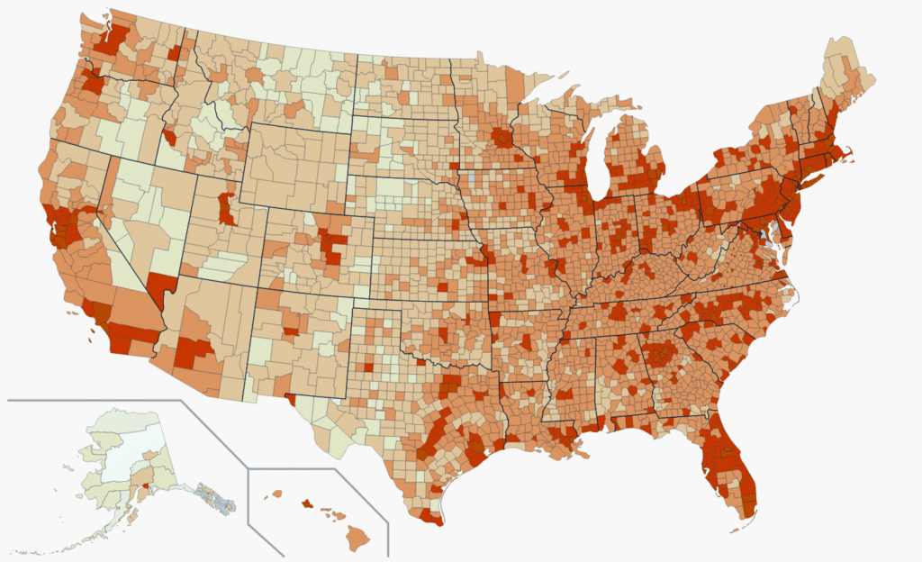
I finally had the “Danger Zone County” info I wanted at my fingertips.
I started pouring over the data, double-checking, and analyzing.
Yup, I enjoy doing this… I’m an Engineer (a.k.a. Engine “NERD.”)
But I quickly noticed some anomalies that didn’t make sense.
I assumed all the highest-density areas would be the superdense US cities (New York, San Fran, Atlanta, Chicago, Etc.)
And while all those Counties were near the top, some were further down the list than anticipated.
While there were a few tiny counties (like Manassas Park City County in Virginia) that were higher on the list than counties near Philadelphia, Tampa, Chicago, St. Louis, and even Atlanta…
What in the world was going on?
So, I dug in some more, and here’s what I found…
Counties come in all different shapes and sizes.
For example:
The most densely populated parts of Atlanta (and its Metro) have a foot in several different counties:
There’s Fulton County, Cobb County, DeKalb County, and Douglas County.
And many of these “Atlanta area” Counties extend far away from the city into areas with much lower population densities.
These county shapes and sizes can play into the same issues I saw with the State Level data.
The counties’ size, shape, and layout affected my comparison from being perfect.
Fulton County is a perfect example of this:
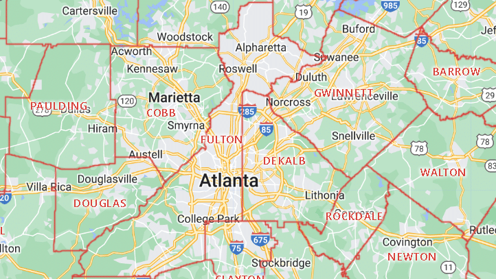
It extends way to the northeast AND southwest of the dense urban areas.
Thus, lowering its OVERALL average population density.
So, after more analysis, I discovered these oddities were NOT THAT big of a deal.
Sure, a few counties were hitting a higher density number than expected, and a few major urban areas were slightly lower…
But in general, over the entire list of 3142 counties in the United States, the highest density areas landed near the top, and the lowest were near the bottom.
And the middle ones were… in the middle.
So, overall, this was still extremely useful data, even if it wasn’t perfect.
Now, during this deep dive, I noticed another interesting phenomenon.
Sometimes I’d see some lower population densities in States I knew for a FACT were relatively small AND highly populated.
So, being curious, I had to find out what was going on.
I discovered some areas in the US that may have extremely low populations BUT are slap dab between several major metropolitan areas.
Often these areas are only a 1- or 2-hour drive from major cities (sometimes less).
For example:
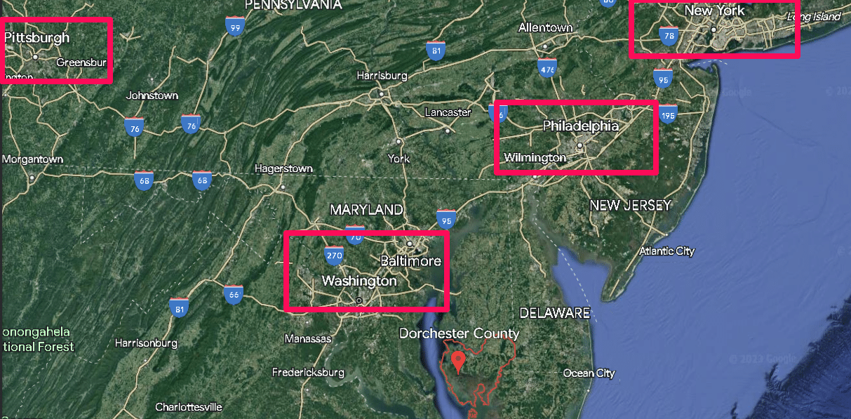
Dorchester County, Maryland, has a Density of .090 people per Square Mile.
But Maryland, the State has one of the highest average Population Densities at .992
So, Dorchester County is 11X less dense than the State average.
That’s what I call an anomaly.
Here’s what’s going on…
If you pull up a map of Dorchester County, you’ll see something right away that takes up a large chunk of the area:
Blackwater National Wildlife Refuge
This Wildlife Refuge is ~ 43.75 square miles – while the entire County is 540 square miles.
So nearly 8% of the area has a population density near ZERO – while the surrounding areas are also very low-density.
This County is a low-density Island surrounded by a sea of high-density cities.
For example:
- From the Eastern Edges of Washington, DC, and Baltimore, MD, are only about 1-hour drive (63 miles away).
- The South Side of Philadelphia only takes under 2 hours at 102 miles.
- Plus, there’s Richmond VI not too far away, as well as Norfolk | Virginia Beach area.
- Atlantic City is within a few days’ walk.
- Heck, THE highest density and largest city (New York City) is only a 3-hour drive and 190 miles away.
So, while Dorchester County “looks” like a safe haven on paper, in reality, I wasn’t comfortable with where it sat on my ‘Danger Zone County List.”
I mean, in my spreadsheet, it’s right next to places like:
- Sebastian County Arkansas
- Barry County Michigan
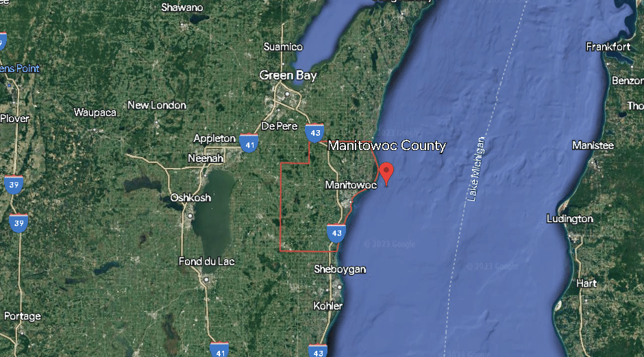
- Manitowoc County Wisconsin
- Upshur County Texas
Sorry, but just looking at a map, you can tell these are NOT comparable locations.
So, I had to figure out how to level-set these Counties somehow.
Otherwise, while the County data was better that the State data, it still had significant problems.
That’s when I decided to combine the State data with County data.
A Mix 95% County | 5% State
County Data is obviously much better than State data (I already proved that above).
But the State data still provides SOME helpful information.
If a State has a very high average density population (even if it’s all very localized to a few major cities), that means any counties within such States are nearby high urban areas.
This “rule” works better for smaller States and less so for large ones.
But in general, States with a very high population density are at a higher risk (no matter how sparse a County is) than a State with a very low population density.
While an individual County may be very low, if it’s within an hour or two of major cities, people will be forced out of these cities looking for food and water in times of massive chaos.
Of course, if you have 2 counties with similar densities, the one in the State with a lower population density has a lower risk.
So, I decided to use both the State and County data – in a weighted form.
Basically, I gave the Counties data 95% of the weight and the State data 5% of the weight.
By doing this, I had a number that primarily used the hyper-localized County data but used a bit of State data as well.
That way, if two Counties had similar data, but one was in Iowa while the other was in Delaware.
Well… the County in Iowa would likely be safer if all hell broke loose, right?
Now that you have everything you need to use this data and understand what it’s telling you.
Until next time:
Prepare, Adapt & Overcome,
“Just In Case” Jack
P.s - I just took this FREE 60-second 'Readiness Score Quiz'👇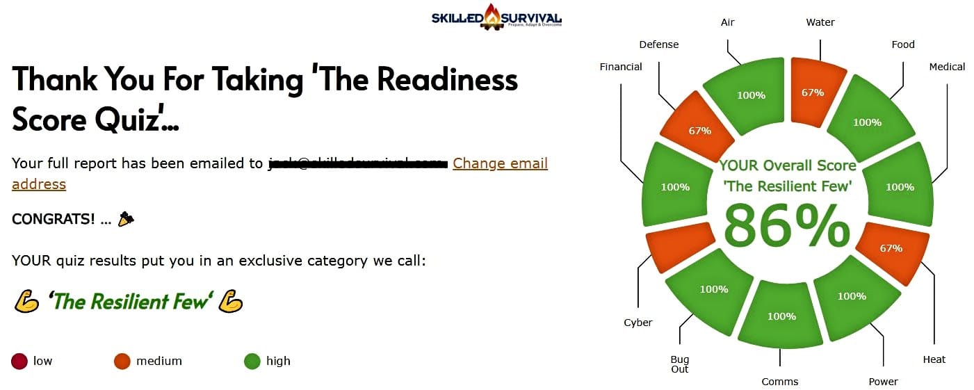
AND... I've still got a few gaps in my preps...🤔 But at least, I'm not part of 'The Fragile Masses'. 👍 Find out where YOU stand by answering a few questions...

Recommended Reading
Valley Food Storage Review: An Expert Puts It To The Test
Unbiased and thorough Valley Food Storage review covering food supplies, packaging, taste, and shelf life. Don't buy without reading this...
Gas Mask: The Best One Chosen By A Preparedness Expert
Our testing and research found the MIRA CM-7M gas mask is the best when looking at value, effectiveness, durability, comfort, and protection.
Bug Out Bag Checklist: The 104 Must-Pack Items & WHY
Use my battle tested 104 item bug out bag checklist to ensure you don't forget anything critical before heading out the door.
Water Storage: Best Solutions & Biggest Mistakes To Avoid)…
The DOs and DON'Ts of long term water storage. We cover the best water storage containers to keep you safe for the long-haul.
How To Make Pemmican: A Super Long Shelf Life Protein
Learn how to make pemmican with this step-by-step guide. Plus, find out how long our pemmican recipe lasts and how it tastes.
Prepper Checklist: 78 Items You Should Stock & WHY
This prepper checklist covers (in detail) EVERY item you must stockpile today to prepare fast and avoid overlooking anything critical.
